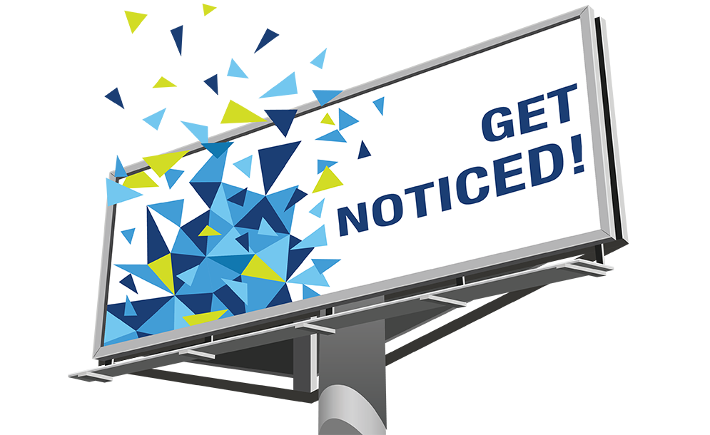
The ideal billboard advertisement contains three basic elements:
- 1
-
IMAGE/GRAPHIC
This grabs the viewer’s attention and makes them look at the ad. The brain processes images faster than it does text.
- 2
-
COPY LINE
This Describes the product, service, or message being advertised.
- 3
-
COMPANY NAME/LOGO/POINT OF CONTACT
This lets the viewer know where they can get the product/service.
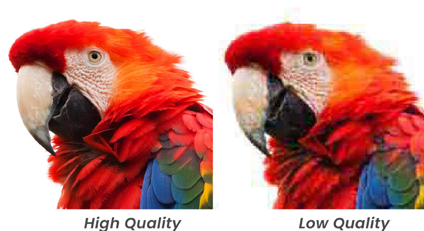
Images/Logos
Use images that are high resolution. Typically, a high-resolution image is 300 ppi (pixels per inch). Lower resolution images will display blurry or pixelated on a billboard design. Choosing large, bold visuals that can be interpreted from far away will grab the attention of onlookers and keep them interested as they get closer to the design.Be sure to choose images that clearly show a product or are relevant to your brand, company, or message.
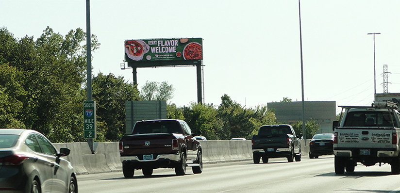
Message/copy
The vast majority of people who see billboards are operating a vehicle. The average driver will only have about 5 to 10 seconds to readthe billboard message and comprehended it.Not many drivers will be able to take their eyes off of the road long enough to read more than a few words on a billboard, so It is recommended to try to limit copy to 7 words or less.
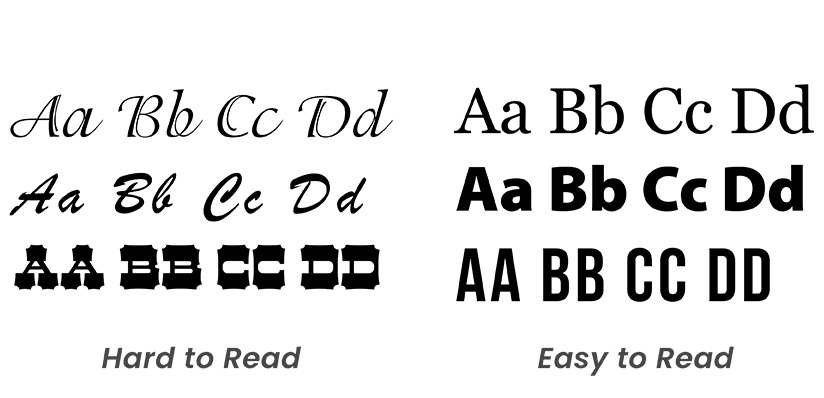
Readability/Typography
Use typefaces that are easy to read. Fancy and ornate fonts should be used sparingly, if at all. Always keep viewing distances in mind as you select type for your ad.
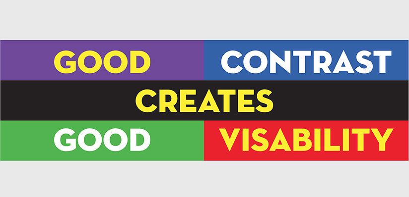
Color/Contrast
Strong color contrast is an important aspect of billboard design. The greater the contrast between the background and copy, the easier it is to read from a distance. Use dark text on light backgrounds and light text on dark backgrounds.